Usually data teams are the ones helping other teams build their dashboards, but what metrics should data teams be using to measure their own performance?
In this post I’m going to go over a common product analytics framework and how it can be applied to data teams who are trying to democratise access to their data.
The analogy that data teams should do things the way product teams do them isn’t new. In a blog post by Shopify, Lin Taylor goes through how to make dashboards using a product thinking approach. During Coalesce 2020, Emilie Schario and Taylor A. Murphy proposed that you should run your data team as a product team.
If we’re going to treat the data and insights from the data warehouse as a product, then we’re going to need to monitor usage and measure success with the same rigour as product teams.
We can then easily measure the impact of initiatives to drive data engagement across the company including data training such as supercooldata, communicating data team updates and improving metadata discovery.
Getting started
We will focus on SQL analytics users mostly but the same techniques can be applied to users of your BI tools.
To get started, you should at the very least measure how many Weekly Active Users (WAU) you have querying the data warehouse after removing scheduled queries.
In Snowflake, this can be calculated using the query history table which has one row for every query executed:
select
    date_trunc('week', date(start_time)) as reporting_week,
    count(distinct user_name) as active_users
from
    snowflake.account_usage.query_history
group by
    reporting_week;
Most other data warehouses have a similar table or view that logs queries executed.
An alternative is to take a 14-day rolling average of your daily active users similar to how Airbnb monitors the outcome of their data education efforts:
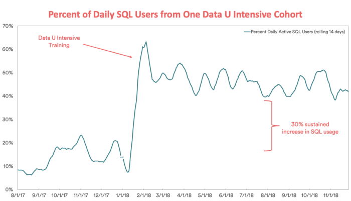 Source: How Airbnb is boosting data literacy with data u intensive training
Growth Accounting
User Growth Accounting is a product analytics framework that fits nicely for the type of usage you might see from a data warehouse in your company.
The two main equations in growth accounting are shown below:
Weekly Active Users (WAU) = New Users + Engaged Users + Reactivated Users
WAU Change = New Users + Reactivated Users - Churned Users
The process each week is illustrated by this diagram:
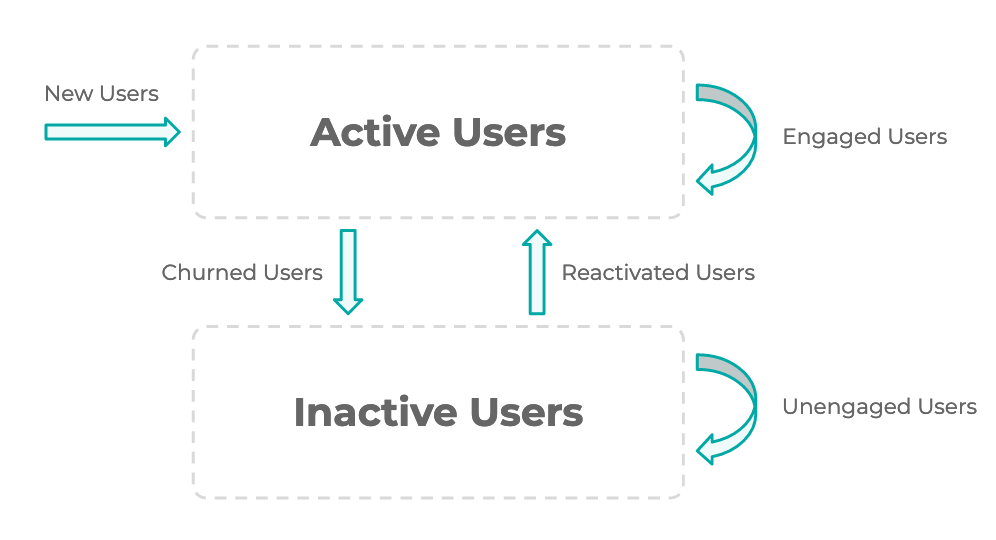
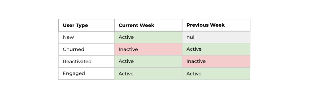
Each user segment is defined based on whether they were active this week and the previous week:
To implement the growth accounting framework in SQL, we need to produce a table similar to the one shown below with one row for every week after a users acquisition week.
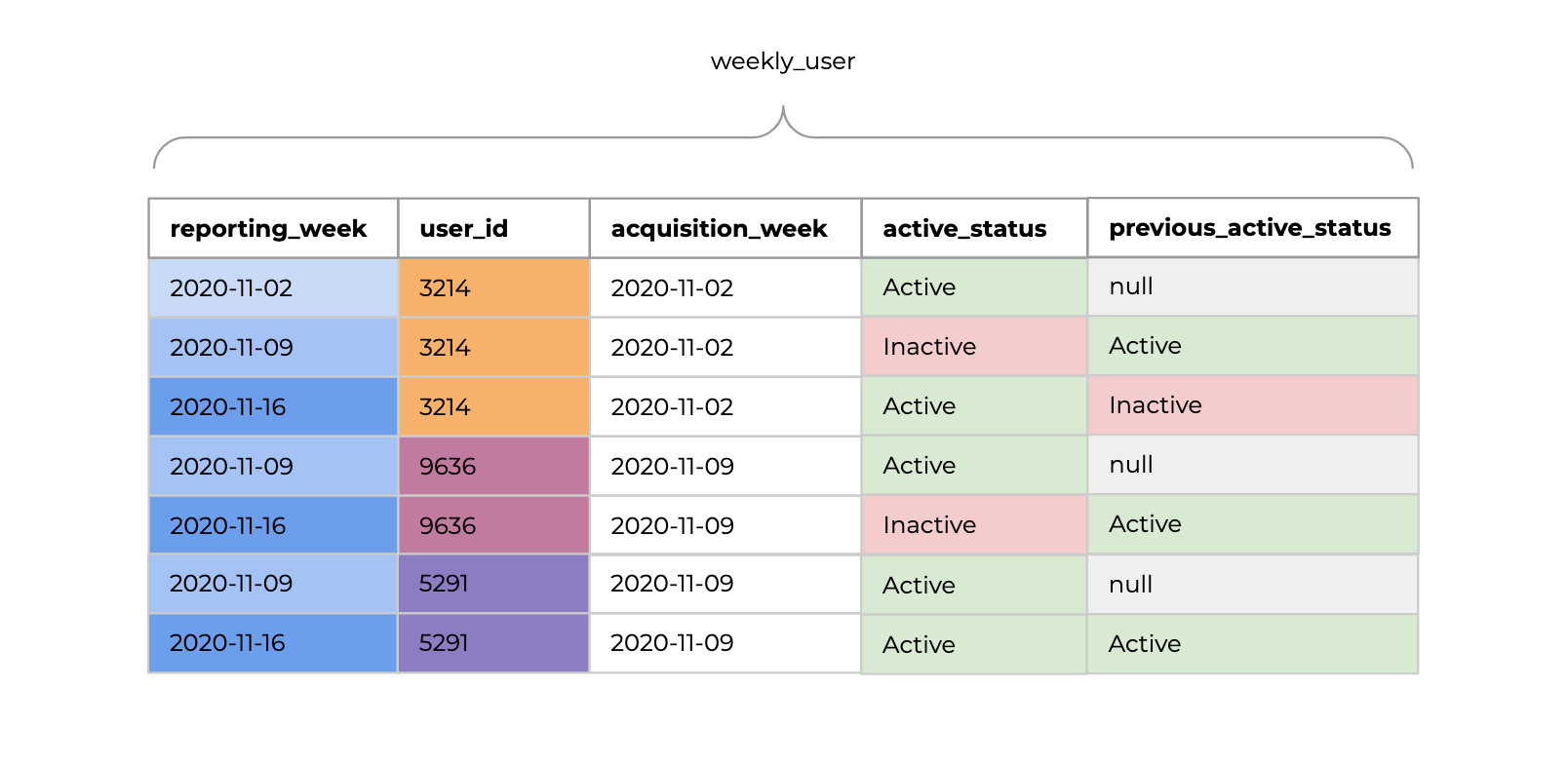
We can then run the query below to determine how many users in each segment each week.
select
    reporting_week,
    sum(case when acquisition_week = reporting_week then 1 else 0 end) as new_users,
    sum(case when active_status = 'Active' then 1 else 0 end) as active_users,
    sum(case when active_status = 'Inactive' then 1 else 0 end) as inactive_users,
    sum(case when active_status = 'Active' and previous_active_status = 'Active' then 1 else 0 end) as engaged_users,
    sum(case when active_status = 'Inactive' and previous_active_status = 'Inactive' then 1 else 0 end) as unengaged_users,
    sum(case when active_status = 'Inactive' and previous_active_status = 'Active' then 1 else 0 end) as churned_users,
    sum(case when active_status = 'Active' and previous_active_status = 'Inactive' then 1 else 0 end) as reactivated_users
from
    weekly_user
group by
    reporting_week
order by
    reporting_week desc;
We can also keep a list of all users and tag them by their segment to understand the current distribution.
Employee engagement drivers
By splitting up our data warehouse users into these separate segments we can not only monitor growth in usage of our data warehouse and dashboards but also develop an understanding of what’s driving that growth.
Did usage have a temporary bump due to that one-off SQL analytics workshop we ran last week?
Are new employees being appropriately on-boarded to the company’s data and actually being given the access they need?
Is the churn rate increasing or do we just have less new employees?
Taking action
Monitoring the usage of these segments separately also allows us to implement actions unique for each user group:
Our new users aren’t engaged, maybe we can share useful queries with new employees to get them started quickly?
For churned users, we might be able to prioritise something that they requested which hasn’t yet been actioned.
How do we get employees unengaged for more than 2 weeks interested in using data again?
Team Alignment
Implementing growth accounting metrics as part of your own teams KPI’s is a great way to keep team members aligned about what’s important.
The number of dashboards your team outputs each week is meaningless if no one if using them.
Building data models and ingestion pipelines isn’t the only primary activity of a data team. By focusing the teams efforts on growing employee engagement with your data, you quickly realise that your time can be better spent on communicating updates with other teams, running data education workshops or building an internal knowledge base to help employees find and use their data.
Keep it simple
A few different metrics have been discussed as part of growth accounting, but it’s not intended that you implement all of them from day one. Only use what’s most relevant to you based on what initiatives you’re running to drive data democratisation or the level of data maturity of your organisation.
If you’re running weekly data sessions to introduce new employees to the data warehouse and existing employees to SQL analytics, then you probably want some form of cohort retention analysis.
If you’re just starting out and arent monitoring anything, just start with learning how many weekly active users you have.
If you’re more mature in your data democratisation efforts, then it doesn’t really make much sense to look at cohort retention analysis as there won’t be too many new users. Using a growth accounting framework for monitoring employee engagement with your data might make more sense.
Vanity metrics
With any product, there are always vanity metrics which sound good but don’t really tell you much about the health of your product. This applies equally to data usage by employees.
It’s better to keep your metrics focused on users rather than aggregates of events which can often be very large in magnitude but quite meaningless.
Bad:
- Total report views
- Total queries executed
- Total report edits
Good:
- Percent/number of users viewed a report
- Percent/number of users executed a unique/new query
- Percent/number of users edited a report
Keep it focused
It’s best not to mix the dashboards monitoring the health of your data pipelines with those monitoring employee engagement with your data.
Even though both of these dashboards might use the same data sources, they have completely different purposes and intended audiences.
The audience for data pipeline dashboards are your data engineers, analysts and data scientists.
The audience for your data democratisation dashboards could be executive leaders, stakeholders and consumers of your teams output.
Keeping the two separate means that non-technical users won’t be confused by technical data jargon related to your pipelines and data warehouse metadata.
Keep it open
Try to keep your data democratisation dashboards as open as possible for other teams or senior stakeholders to view. This means you probably shouldn’t include any private information like user names of churned users. You might want to have two separate dashboards, one for anyone in the organisation to view and one for your team with more details.
Implementation notes:
Metric frequency
It doesn’t make much sense to look at daily metrics and so ideally you would base your measurement on a weekly frequency. Depending on the size of your company and volume of usage, a monthly frequency might be more appropriate.
Medium or large companies
This approach generally applies to larger companies with at least 100 potential SQL analytics users across the organisation.
Not all data initiatives
These metrics mostly relate to the success of data democratisation within your company and don’t really include the value from machine learning initiatives or value of the data warehouse to building new product features.
Scheduled queries
It goes without saying that you should remove scheduled SQL queries from the logs before starting the analysis. If you can’t separate automated from manually submitted queries, then your team has bigger issues and it’s best to solve this problem first!
BI tool metadata
Different BI tools provide access to usage metadata in different ways. Methods include: a transactional database that might be accessible, a poorly documented API, SQL query tagging or none at all.
It’s usually easiest to start with direct SQL analytics users from the data warehouse logs. When you need more information to cover more aspects of data democratisation, investigate how you can extract metadata from your BI tool.
Once you have the BI metadata, then you can implement a similar framework to measure employee engagement with your visualisation platform.
Final thoughts
Building dashboards, reports and data assets is very similar to building a product. As data teams, we should be at least as data-driven as other teams in monitoring our measures of success and setting goals.
By taking a product minded approach to monitoring the success of your teams work, you change the thought process about what actions you need to take to drive success.
Maybe your team doesn’t need any new dashboards this quarter and they should focus on the acquisition of new users to the BI platform or data warehouse?
If your users are churning, you need to find out why, perhaps their reports aren’t relevant anymore and need an update?
Perhaps engaged users only monitor a single report, maybe they don’t know about the other five that already exist which are relevant to them.
This blog post started from a discussion we had internally regarding how we should measure the success of data literacy initiatives like supercooldata.
We realised pretty quickly that this was a solved problem and product managers have built great frameworks to help monitor, understand and drive engagement with their products. We should use the same frameworks to measure the success and value-add of our own product.
If you want to drive data democratisation at your company, check out supercooldata.