We previously set up BigQuery and loaded our data into it in the last two tutorials:
In this tutorial I’m going to show you how to build your first ever chart with SQL. It will be a short one because it’s actually really simple.
start sales pitch
If you want to quickly skill-up in SQL to learn how to analyse data, hmm… check out supercooldata.com :)
end sales pitch
The first step is to understand what data we’re going to use. We will use the Google Search Console data we loaded with Fivetran.
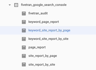
It’s super simple to set up with Fivetran. Once you’ve done that you should have the following tables available in BigQuery and these will update with the schedules that you’ve set in the Fivetran UI.
These are the tables you will see in BigQuery:
These are the columns available in each of the tables:
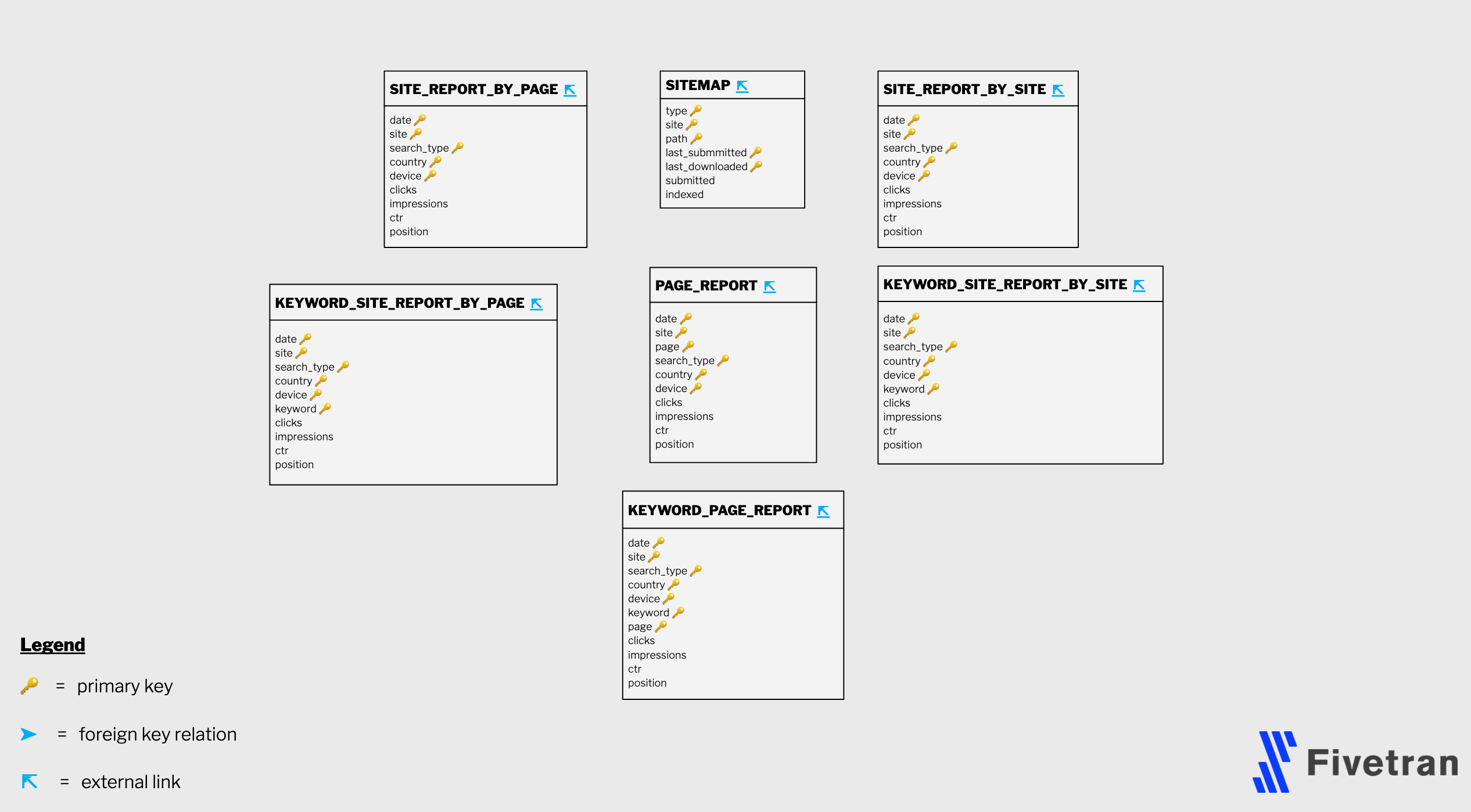
This is called an Entity Relationship Diagram (ERD). It pretty much just tells you all the tables and columns available and how they link together.
Fivetran gives you an ERD for each connector you set up. It is very useful for understanding how to analyse your data and what table to query to get different answers.
You can access this in the documentation for any connector. Here is the Google Search Console connector documentation:
https://fivetran.com/connectors/google-search-console
We’re going to query the table keyword_site_report_by_page.
This table has one row for every unique combination of country, date, device, keyword, search_type and site. This is known as the composite key of the table.
The first step is just to see the data and what it looks like:
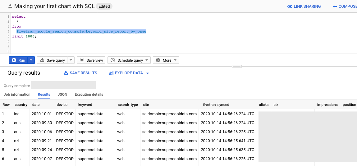
The query used is below:
select
  *
from
  fivetran_google_search_console.keyword_site_report_by_page
limit 1000;
The query returns 1000 rows of all columns (the * symbol selects all columns) from the keyword_site_report_by_page table within the fivetran_google_search_console dataset or schema.
The question we want to answer from this dataset is which categories of keywords produce the most impressions for us.
The data is for the supercooldata.com domain and so common keywords to arrive at this page are “SEO” and “SQL” as well as the combination of the two. You might also get to this page by searching for ‘supercooldata’ or some variant which we categorise as ‘Branded Search’ in our SQL query.
We will create an if/else statement to categorise our keywords into a handful of groups. In SQL, this is known as a case/when and does the same thing as an if statement in Excel or other tools and languages.
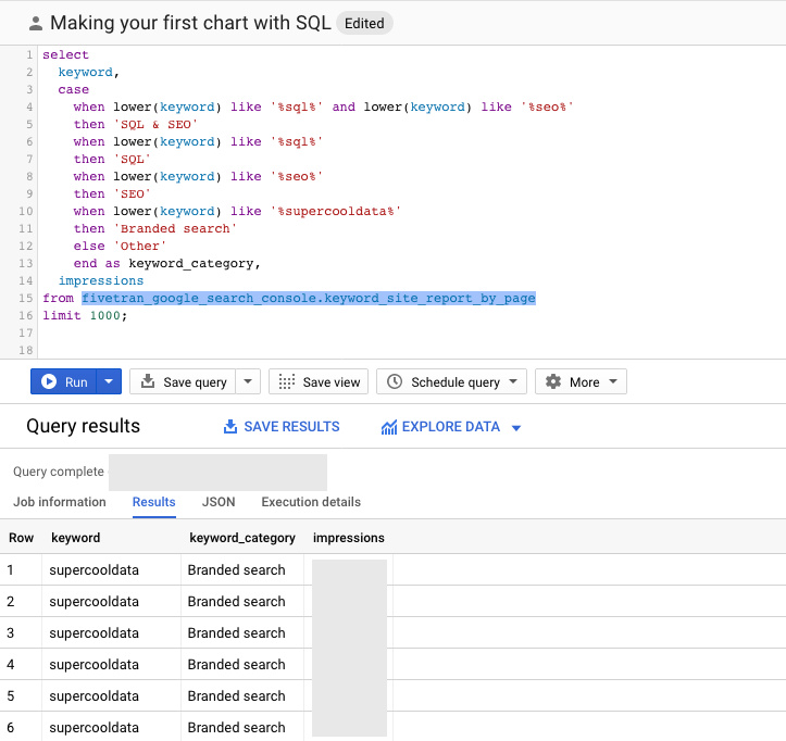
The query result set is showing multiple rows for the same keyword because the composite key (definition of a unique row) of the table is still the combination of country, date, device, keyword, search_type and site.
select
  keyword,
  case
    when lower(keyword) like '%sql%' and lower(keyword) like '%seo%'
    then 'SQL & SEO'
    when lower(keyword) like '%sql%'
    then 'SQL'
    when lower(keyword) like '%seo%'
    then 'SEO'
    when lower(keyword) like '%supercooldata%'
    then 'Branded search'
    else 'Other'
    end as keyword_category,
  impressions
from fivetran_google_search_console.keyword_site_report_by_page
limit 1000;
The query above returns 1000 rows of the keyword and impressions columns as well as a new generated column which we named keyword_category from the keyword_site_report_by_page table.
The keyword_category column is a simple if statement which puts each keyword into a group. The first when condition is:
when lower(keyword) like '%sql%' and lower(keyword) like '%seo%'.
This says if the lowercase of the keyword column contains the value sql and it contains the value seo then put this row in the category SQL & SEO.
We need to aggregate the table so it shows us a single row for every unique keyword_category. We also need to tell BigQuery how to combine multiple rows, to do this we will use the sum function.
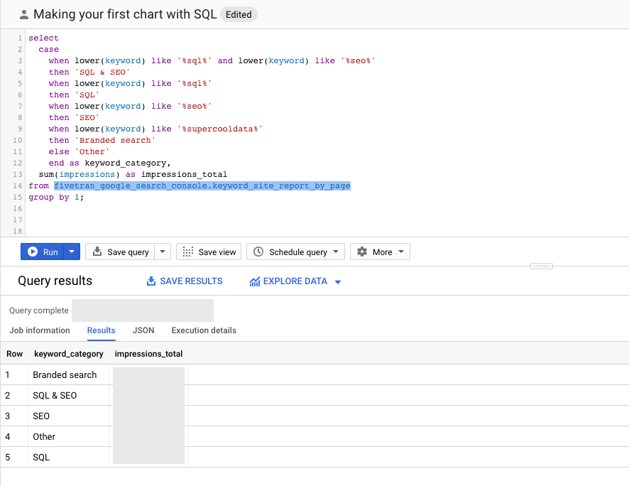
We need a new query which we ran below:
select
  case
    when lower(keyword) like '%sql%' and lower(keyword) like '%seo%'
    then 'SQL & SEO'
    when lower(keyword) like '%sql%'
    then 'SQL'
    when lower(keyword) like '%seo%'
    then 'SEO'
    when lower(keyword) like '%supercooldata%'
    then 'Branded search'
    else 'Other'
    end as keyword_category,
  sum(impressions) as impressions_total
from fivetran_google_search_console.keyword_site_report_by_page
group by 1;
This query groups on the keyword_category column and sums the impressions column to produce a new column called impressions_total.
We now have a query we can use to build a bar chart!
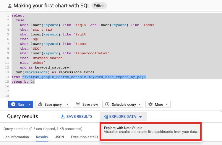
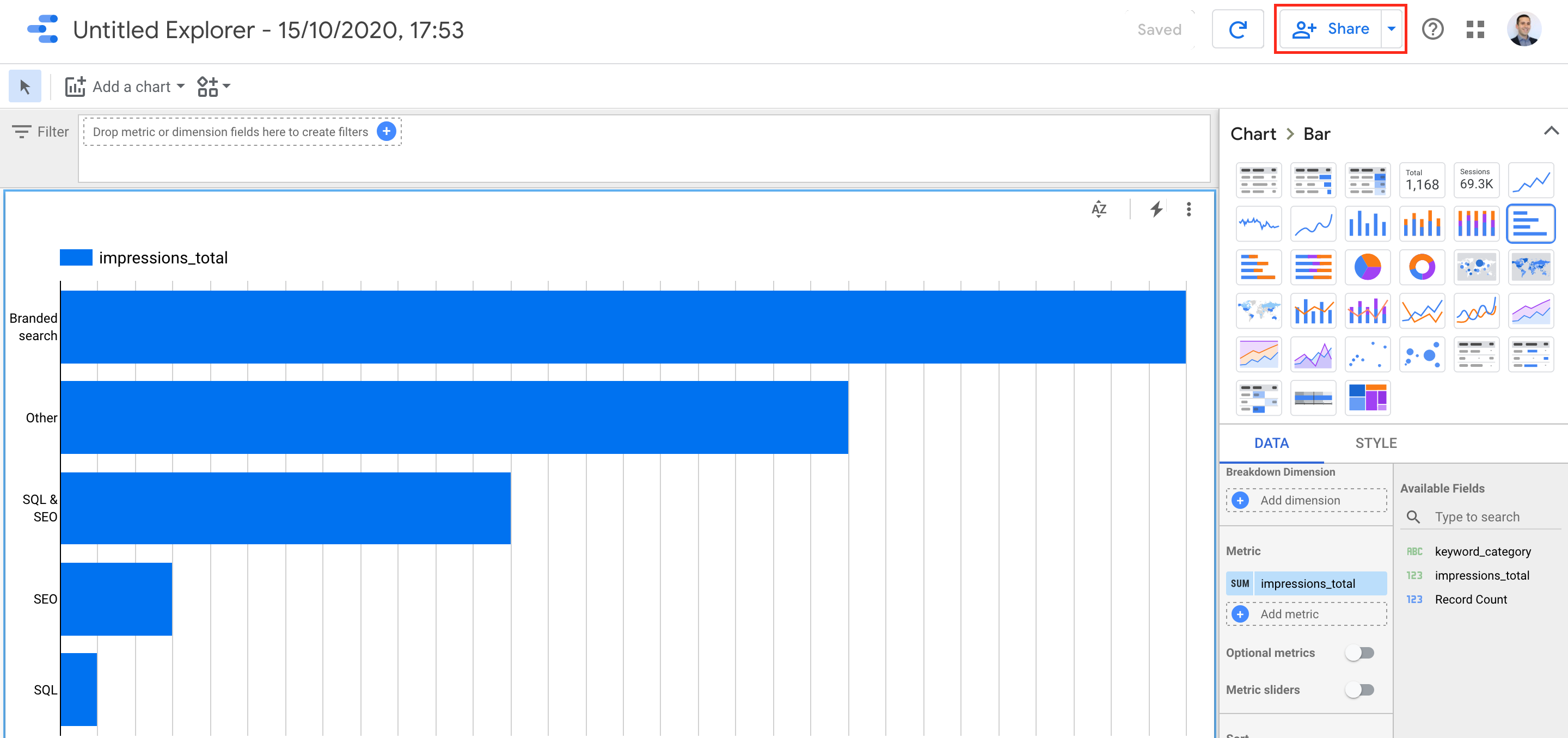
Click on “EXPLORE DATA”
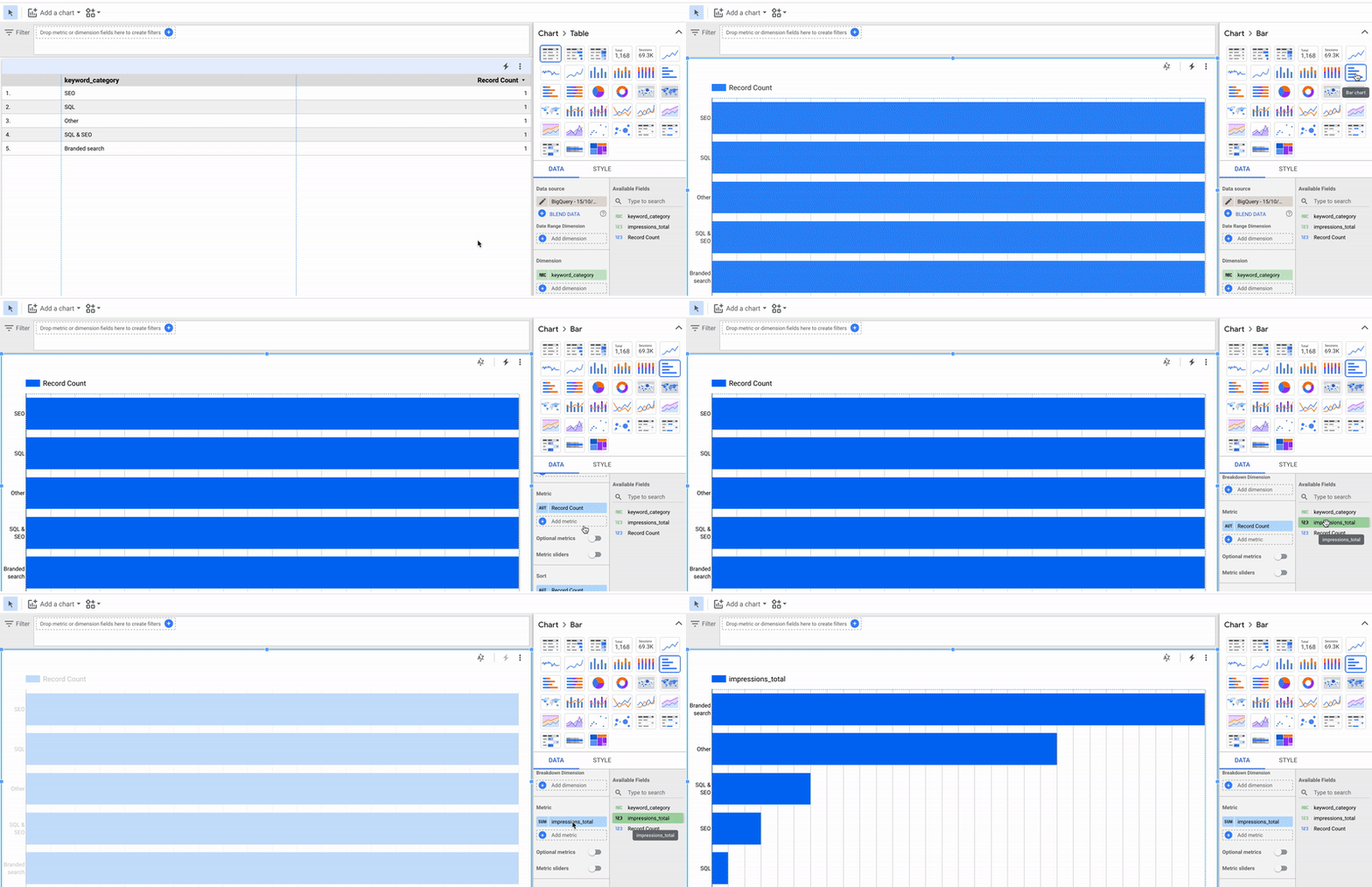
Choose the bar chart option on the top right. Move the impressions_total field to replace the Record Count field in the Metric panel on the right.
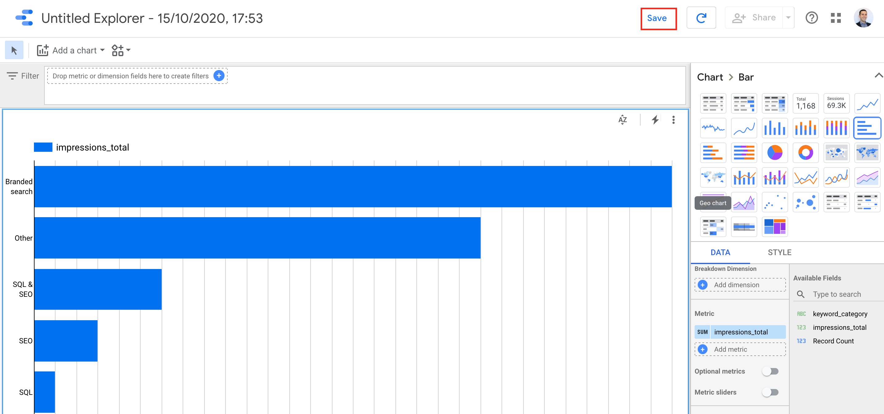
What a beautiful chart!

Click save on the top right.
Click share.
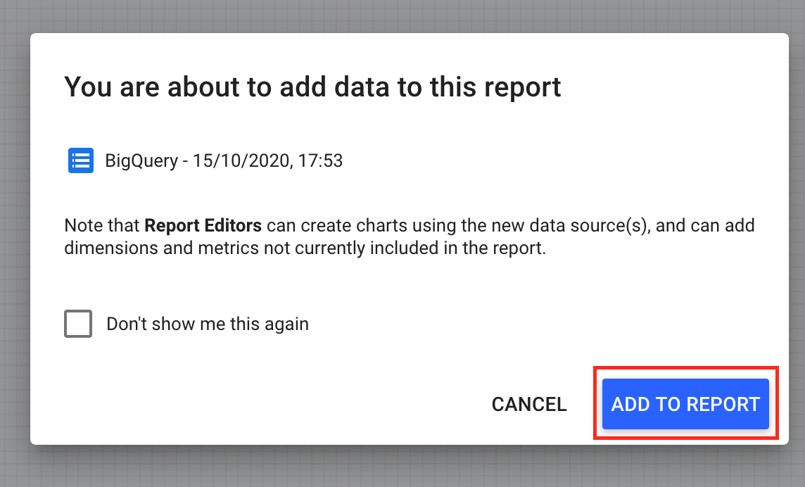
Click add.
Rename your report.
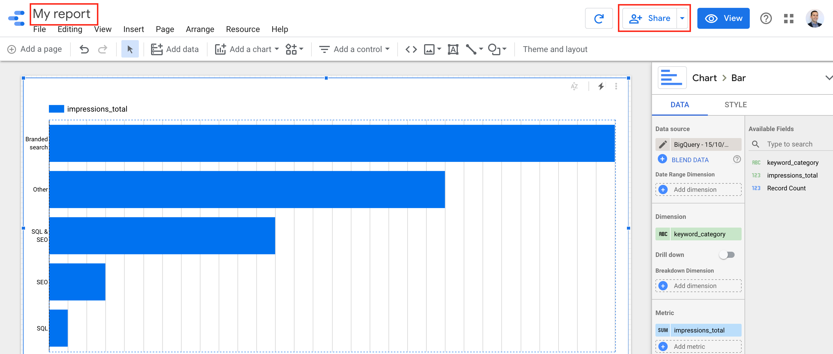
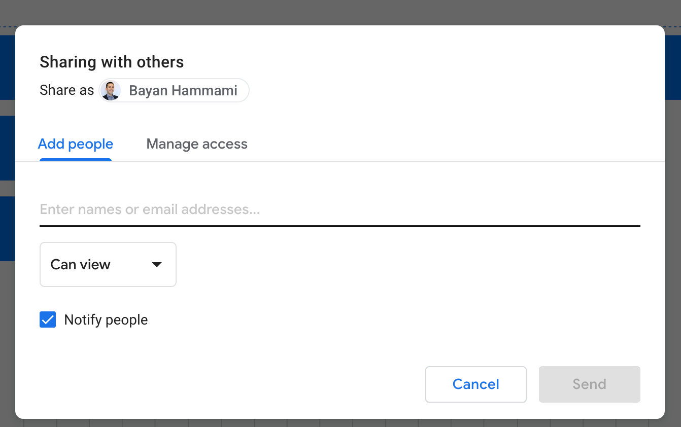
Now share with your colleagues!
That’s it.
In this blog post series, we set up BigQuery, learnt how to load data into BigQuery with Fivetran (with no coding), we wrote a SQL query, made a plot and then learnt how to share it!